The future of low-code development is coming clearly into view, and it's going to be browser-based. Most of today's best examples of productivity-enhancing platforms don't require installing desktop programs or uploading apps to local servers but instead just opening a browser window and pointing to an address. Building, testing, and deploying applications all happen in the cloud without us having to install anything on our computers, phones, or tablets. Claris FileMaker is taking baby steps into the next generation of its low-code development platform with its new Quick Start Experience. The Quick Start Experience, which is available for users running the most recent version of the software on macOS, opens the door, just a little, to a fresh way of using a product we've been using for years. The tool allows new users and citizen developers to learn how to use FileMaker quickly.
Create Apps Quickly
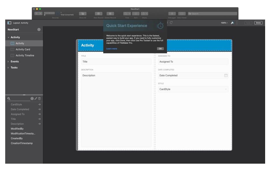
To get to the new Quick Start Experience, we need to create a new app by going to the File menu and selecting the "Create New..." option. After doing that, we're greeted with the standard screen that hosts the My Apps, Favorites, Recent, and Create controls. After clicking on Create, we're directed to the following screen: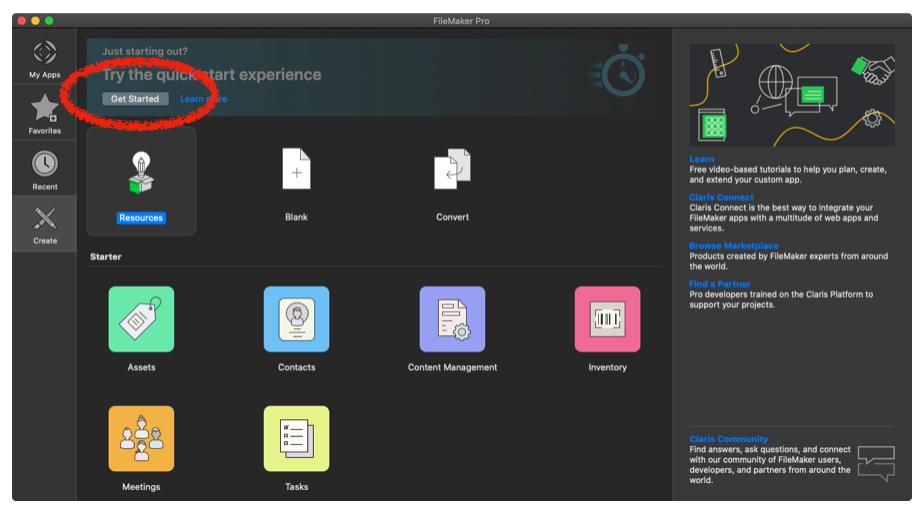 At the very top of this Create panel, we see a header area with a button labeled Get Started, which will launch the Quick Start Experience. After clicking it and naming our new app, we're presented with a brand new interface for creating and editing FileMaker apps.
The user interface is very similar to the current one, but it's streamlined and rendered within an embedded web browser. Claris has made a point to keep this interface as efficient as they can without holding back too much of the power of FileMaker. We can still create a new field in our default table by clicking the "+" button above our field list in the lower left-hand portion of the screen. They even give us some shortcuts for creating elements like phone numbers, pop-up menus, and checkbox sets. Basic number and text fields are still available, of course.
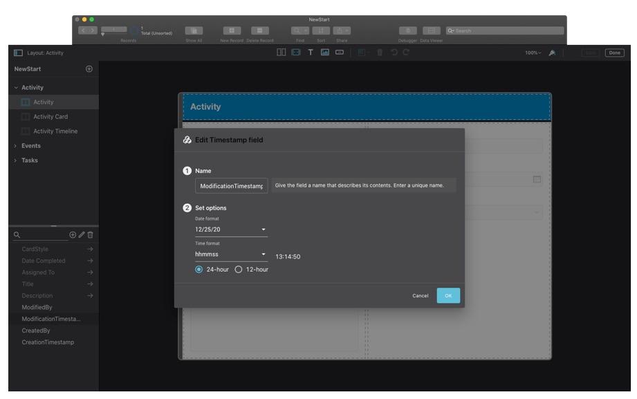
We can also edit an existing field by selecting the "pencil" icon next to the new field button.
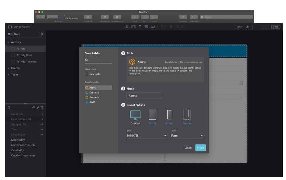
Creating and modifying fields is all fine and good, but what if we need a new table or want to change an existing one? Well, Claris has thought of that too. When we click the "+" button in the upper left of the window, a table card appears.
Let's shift to Claris's new perspective on layout mode, which is a departure from their traditional approach that has been with us since the mid-1980s. They've moved from the static desktop publishing model they've always used to a responsive web design model. This web-like responsiveness is accomplished using the new Grid Object. Placing objects, like fields and their respective labels, into a grid ensures that they stay in place regardless of how the window changes.
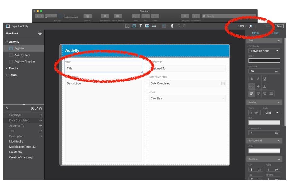
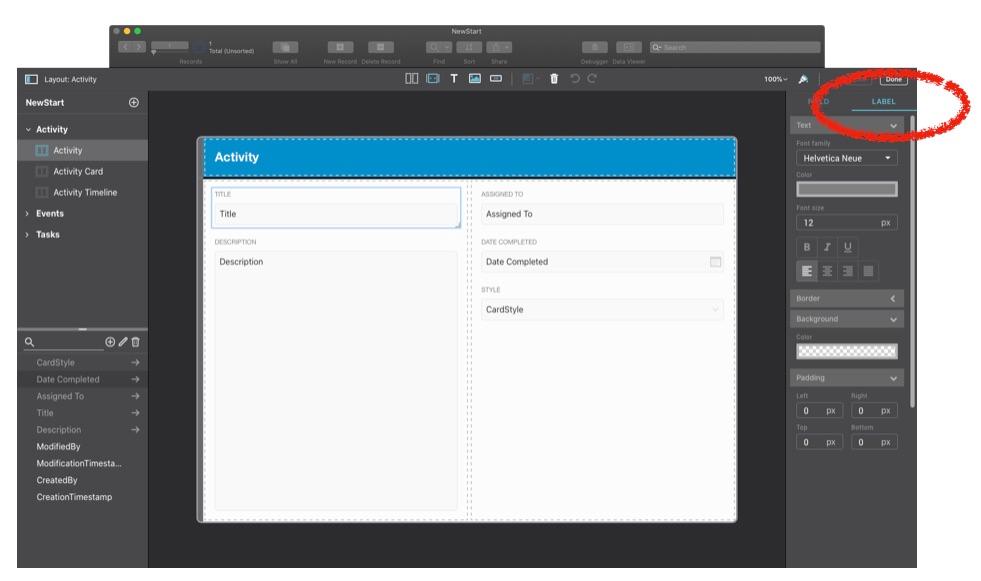
Speaking of fields, let's look at how we modify their look and feel using some of the new Inspector options. Click the dripping paintbrush icon on the upper right of the screen to turn on the Inspector.
You may also notice that fields and their labels are treated as one object with different tabs on the Inspector.
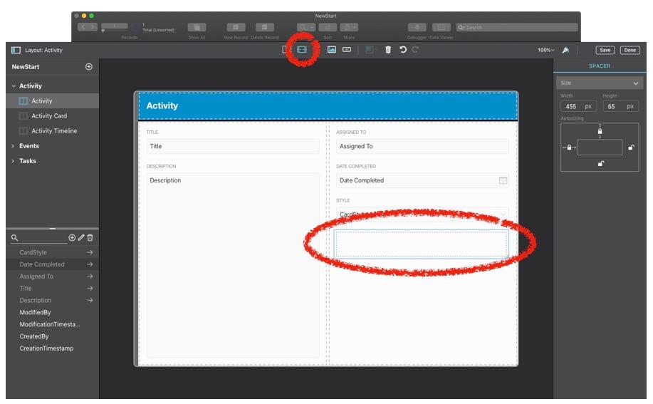
That isn't the only new type of object; Claris has given us Spacers that help keep objects from jamming into one another when the browser window resizes or the layout displays on a small device, like a phone.
These are just some of the new features that Claris has introduced over the last few months. In our next post, we review other useful properties, including buttons, new layouts, and add-ons. Read more.
If you don't see utilities you want or need, be patient. We expect Claris will release new functions slowly but surely.
This article is also published on FileMakerProGurus.com.


