One of the things our clients often request is for us to set up their custom application so that it is mandatory for users to fill in certain fields. You all know what this looks like, right? You go to a website to sign up for a service and next to the places you have to put your email and password, you see a little red asterisk. And then at the bottom or top, or somewhere on the page, it will be explained that these fields are required. Now you can specify required fields in FileMaker Pro quickly and easily.
This usually involves two things. First, setting up the app to require those fields, so that if the user doesn’t fill them in, it yells at them. We’re not going to talk about how to do that today. Sorry! We'll save that for another blog post.
But, we are going to talk about setting up the user interface (UI), so that the user can easily see which fields are required. As with many things in FileMaker Pro, there are a number of ways to accomplish a task. You can set up conditional formatting or you can even have a text block with an on-hide calculation. But I like to keep things simple, if I can, and just have a piece of code that I can copy and paste on each field. And here it is:
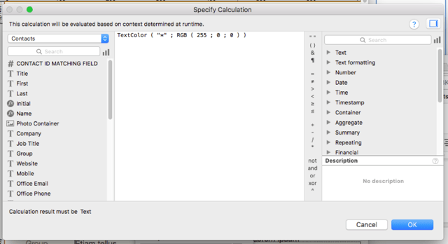
TextColor ( "*" ; RGB ( 255 ; 0 ; 0 ) )
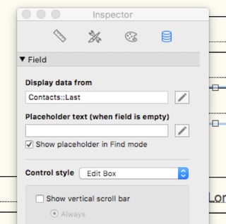
What? How? Why? Where do you put this code? In FileMaker 16, every field now has the ability to show placeholder text. Text that only shows up if the field is empty. Which is why this is such a great little technique. FileMaker Pro is already doing the calculation for you – figuring out if the field is empty. Placeholder text only shows up if you have not entered anything in the field.
Here’s the catch with placeholder text: there is no way to easily change the color, size and formatting of the placeholder text within the FileMaker UI. Or is there?
How to Format Placeholder Text
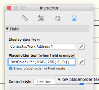
FileMaker Pro has helpfully allowed you to use the calculation engine to generate the placeholder text. And since we can use the calculation engine, we can use all of the functions in that space – including the TextColor Function. Crazy, right?
I take the text I want to show up in the field – an asterisk – and then use the TextColor Function to turn it red.
I can copy and paste this calculation – exactly as is, no changes, no pieces of code that have to be specific to the actual field – into the placeholder text for every field that I want to show as being required.
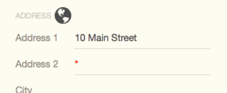
The asterisk will show up when the field is empty:
And then disappear once the field has been filled in:
Easy peasy. Of course, this is just the first step. Depending on how you name your fields, you can have FileMaker Pro calculate the name of the field and add that to the red text. You can also enlarge the asterisk, change the font and/or place any kind of text into that space. But as a simple quick and dirty way of introducing a UI element that indicates which fields are required, I thought this was hard to beat.


