The major design aspects are usually presented in a wireframe, which essentially is a blueprint of the application. Users can usually tell whether the application will meet their expectations in terms of functionality and workflow just based on the wireframe. But as they say, the devil is in the details. We envisioned a way to remove the clutter from fields in FileMaker Pro so that the interface is as clean and clear as possible. The Support Group takes FileMaker Pro
Rejoice for Placeholders
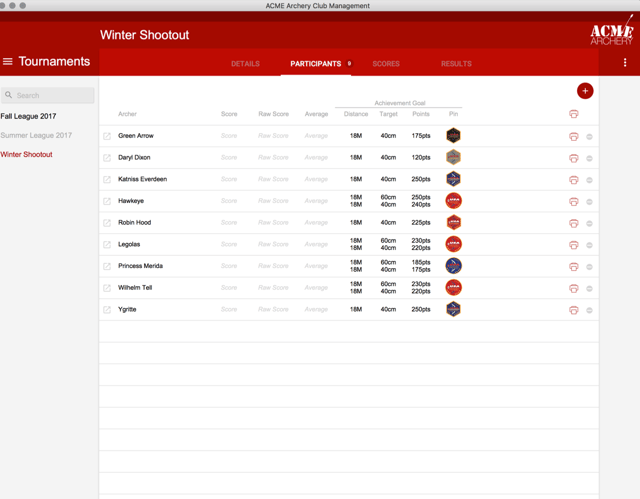
With the addition of placeholder data, we all said: "Hallelujah!" The placeholder content allows users to see that they can enter data into a field and it can even indicate the acceptable format of the entry. However, we can overuse this feature and it results in a very busy looking interface, especially when you're trying to apply a minimalist approach to a design and you have with fields with no borders. Two areas in particular where placeholders are necessary and yet result in a very busy interface are in portals and list views. These portals or lists may already have headers on the column which indicate the data that goes there. So, when adding the placeholder content, it can just look too busy, not to mention redundant. See what I mean?
This doesn't necessarily look terrible, but trust me, it can be worse. And why aim for good when you can do better?
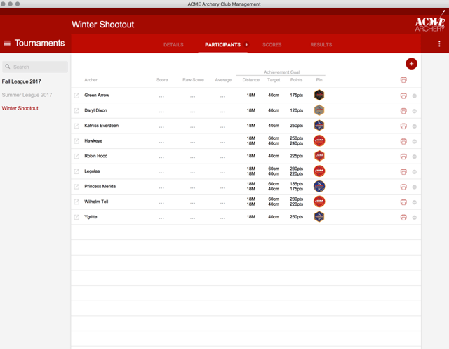
Solution? Very simple. We simply add ellipses into the fields which create a very elegant "placeholder" without cluttering the interface. Tada!
Sometimes a little can go a long way in FileMaker Pro design. Learn more FileMaker design tips including how to use Material Design icons in FileMaker and create calendars in FileMaker.


