In our previous blog posts, we reviewed the following:
- What a CRM is
- The requirements for a basic CRM
- How to create an entity relationship diagram (ERD) for that CRM
- How to create a CRM database in FileMaker
In this final post, we will review how to design a FileMaker CRM to finish up the system.
So, after creating the tables, fields, and relationships, the only thing left is to design the user interface (UI). Again, aiming for the most straightforward route here, our first inclination is to create a master-detail layout for each module – Contacts, Companies, and Interactions. But as we think about it, interactions are always related to a contact record; therefore, those details will live within the Contacts screen.
CRM Design
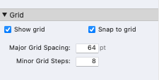
An important thing we do before creating any of the UI is to establish the grid. We usually set the grid to be divisible by 8 points, with the major grid lines at 64 points. We can find many tutorials and guidelines that review the benefits of a grid when designing UI and the specific benefits of an 8 pt grid. It's also helpful to watch 5 Quick Ways to Use Material Design to Improve the UI/UX of your Solution, our presentation from AutoEnter. You can make these adjustments in the position tab of the Inspector, and it looks like this:
 Next, we choose a theme. We usually build our own theme using Material Design guidelines, but we want to keep this simple, so we will use the built-in Apex Blue theme. We’ll use one of the default screen size guidelines for our layout size of 1280 x 960 (notice how those are both divisible by 8).
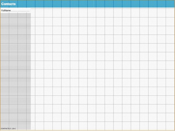
Then, we’ll create a portal for the current table on the left and include a calculation field for FullName for the contact table. We don’t want to display two fields in the portal and would like to display the last name first. This arrangement is easy to do with a calculation, but we could also do it with a merge field. Lastly, we’ll put a text object labeled “Contacts” in the header. Our layout looks like this now:
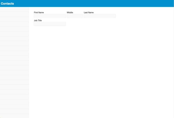
 Now to start placing fields on the layout. FileMaker doesn’t automatically create fields sized to the grid by default, so we place one field on the layout and adjust the sizes to fit on the 8-pt grid. Then we duplicate that initial field and change the field associated with that object and label it accordingly. This way, we don’t have to keep adjusting the size – just the associated field. Throughout this, we try to use the styles associated with the theme to keep things straightforward.
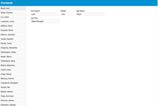
 We find it challenging to design the solution without any data, so we will add some sample contacts to help us visualize how things will look.
  Now we have to add some tab controls. We created tab control for “Contact Info” and “Interactions” and then created portals for our related phone, email, and address tables. Again, in the spirit of keeping things simple, we did not make any scripts or buttons; we just used out-of-the-box FileMaker functionality here. For the most part, we maintained the Apex Blue theme, only adjusting one or two small things.
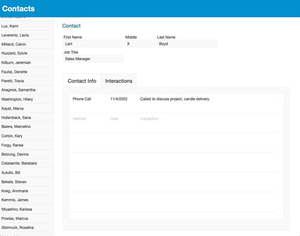
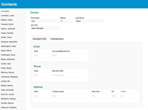 The last step is to add the interactions portal. Since we already have a portal for addresses, we’ll copy that and link it to the interactions table. However, interactions might involve more information, so we increased the row height.
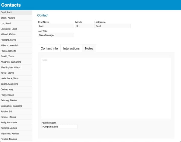
 And with that, we have the basic building blocks of a CRM developed in FileMaker. But remember, this is for Big Candle, and we want to know each contact's favorite candle scent. Where do we put that? Well, with FileMaker, and a low-code environment, it’s pretty easy to add that to our build. It feels natural to put that kind of information in a section with other miscellaneous information, so we're going to create a tab called “Notes” and add not only the favorite scent but a field for general notes about this contact. This text field could be a catch-all place to put information about the contact, like the spouse's name, birthday, and other information.
 And we’re done! Now it’s time to go to the client and demonstrate the solution. Again, this is an elementary example; there are many things we could do to make it more elegant and easy to use through scripting and other tricks. But as a simple example of a basic, customized CRM that can be extended and further tailored using the low-code tools FileMaker provides, this should do the trick. Feel free to download our FileMaker CRM sample file.
Sign up for our newsletter to keep up with more custom app development news and trends.
This article is also published on FileMakerProGurus.com.


